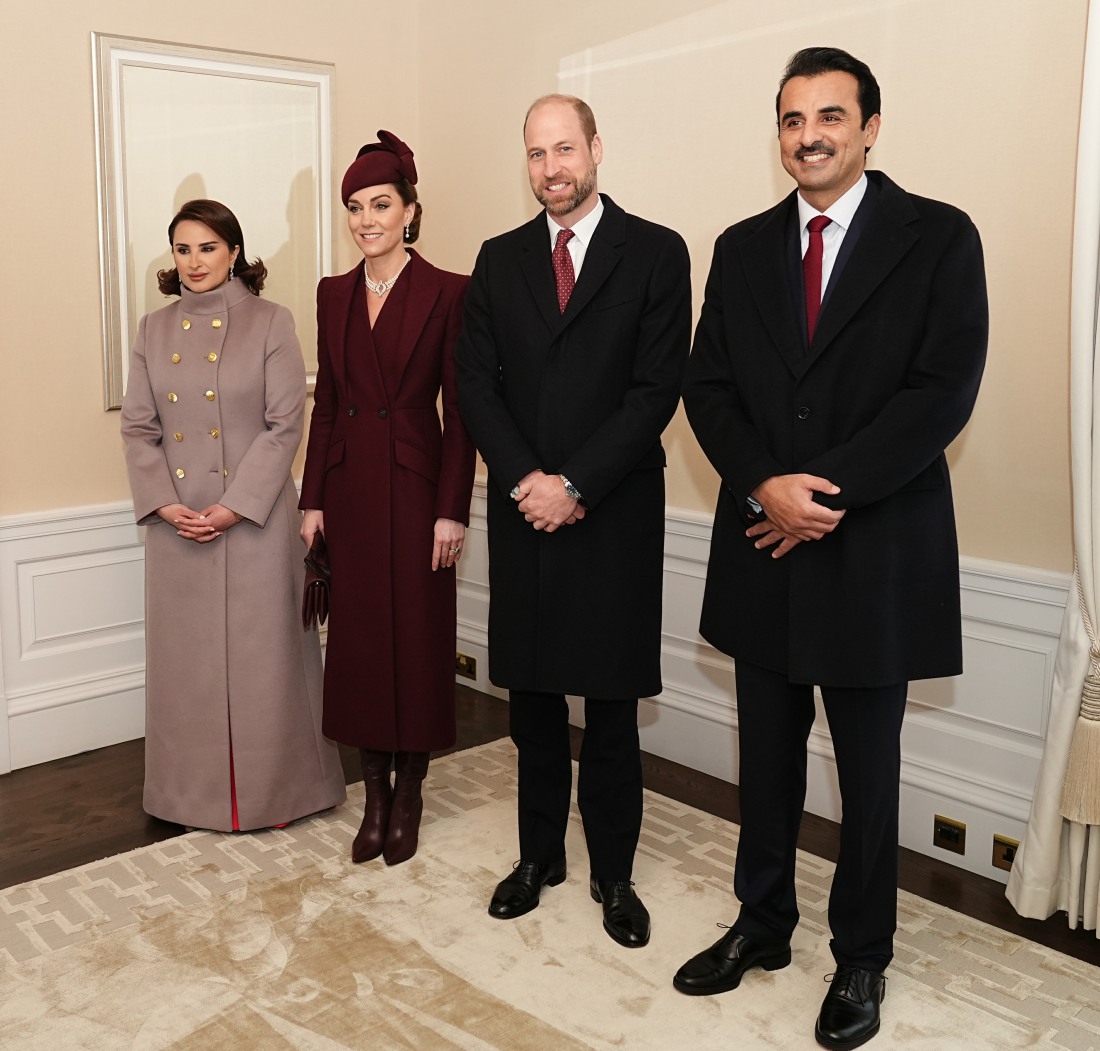
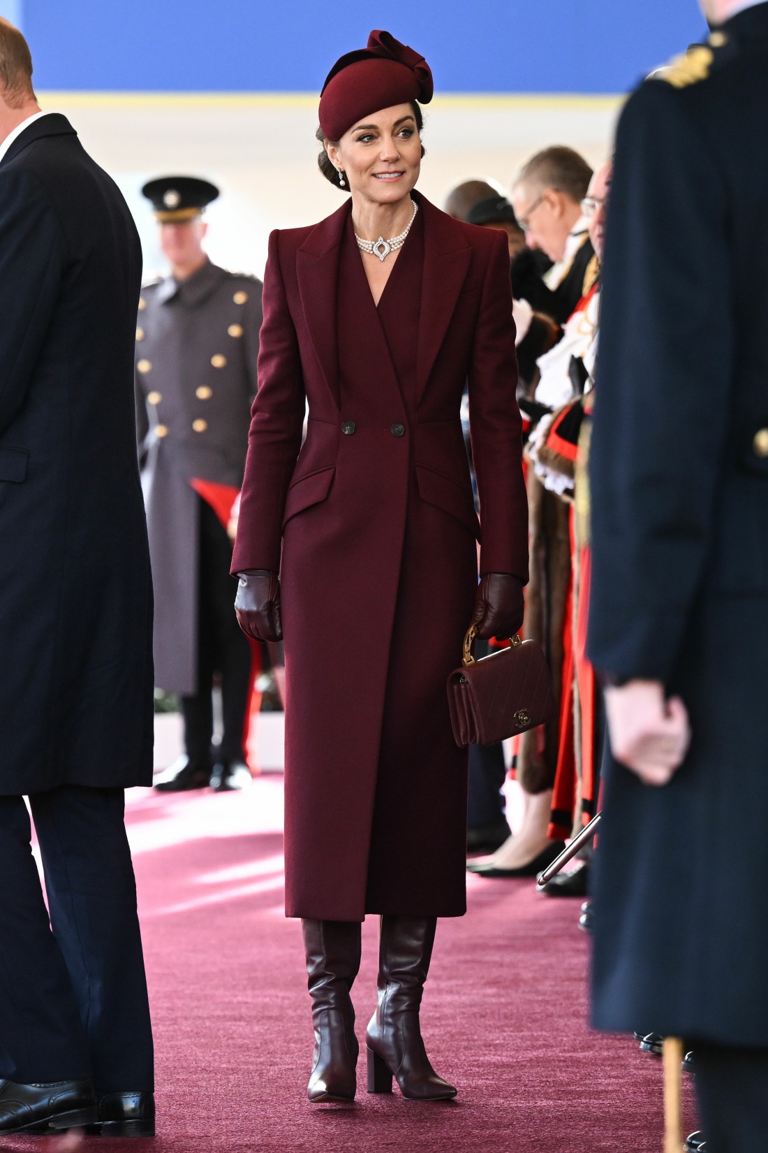
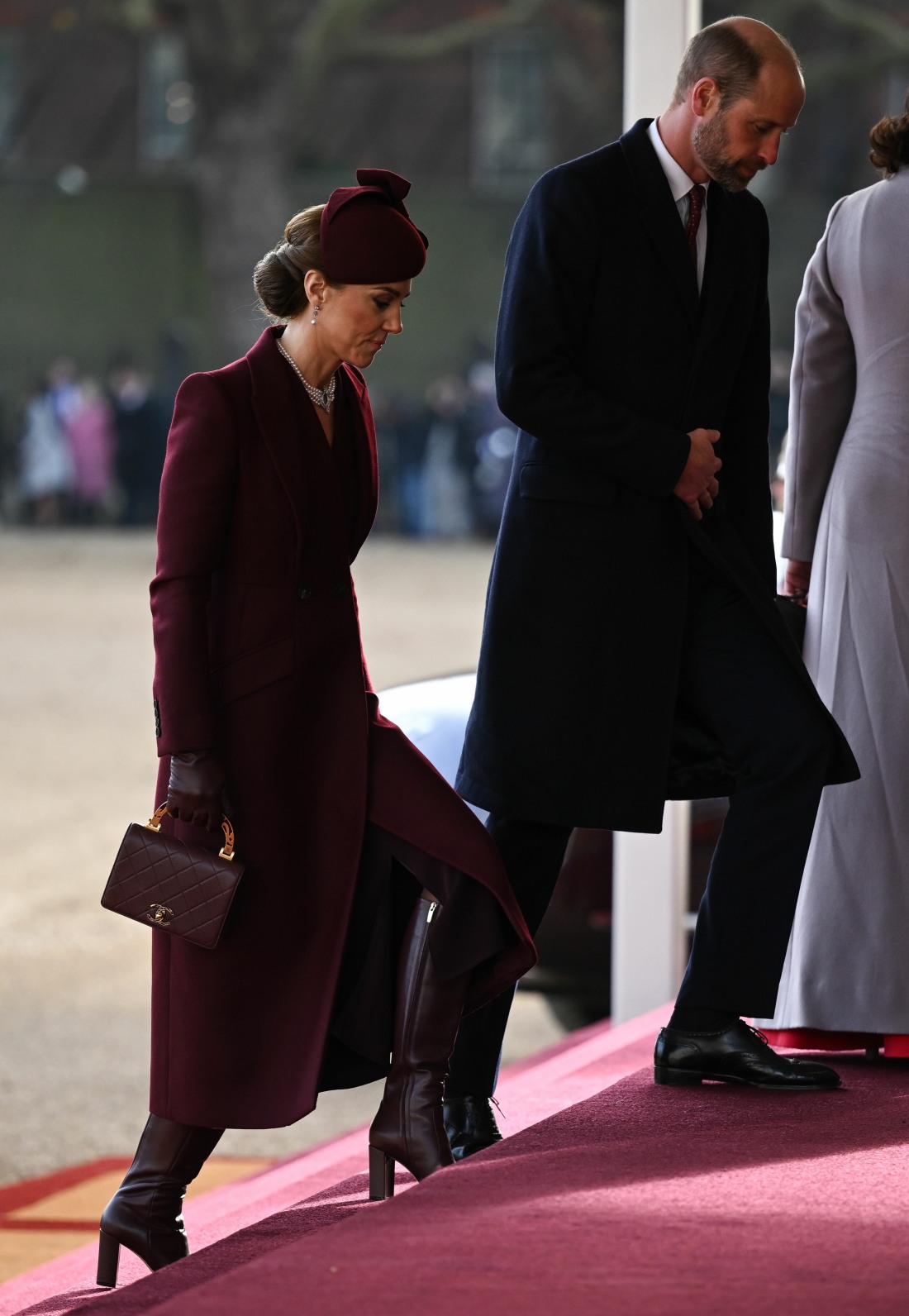
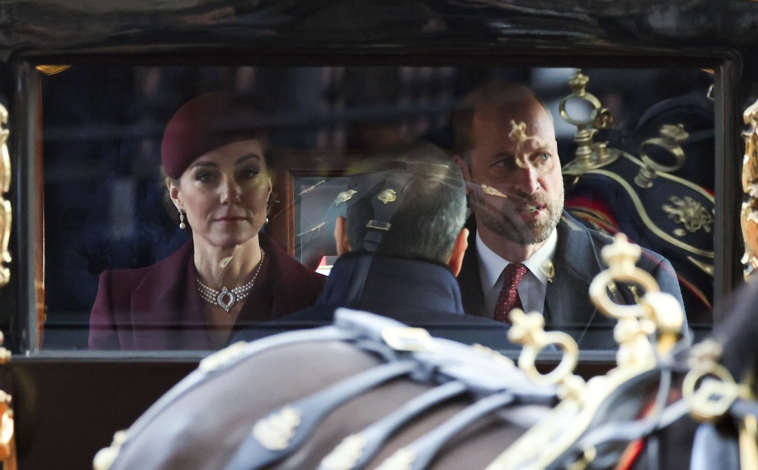
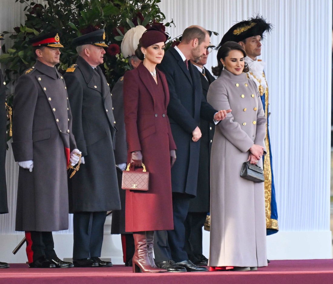
Are we still talking about the Princess of Wales’ appearance on Tuesday? Kate joined Prince William at the welcome ceremony for the Qatari royals. From what I’ve seen, Kate did not flash anyone, nor did she make an ass out of herself. Did she sort of look zonked out, like maybe she slipped herself a valium to get through the day? For sure. Beyond her general valium-haze vibe, people are still talking about her ensemble for some reason. I found the burgundy McQueen coat to be pretty typical Kate-wear: fussy, Edwardian, the wrong proportions. But the goal was clearly to dress like Qatar’s flag and to avoid flashing people. And she succeeded.
British Vogue called this shade of burgundy “the key color of the moment” – darker shades of maroon and burgundy in the Christmas season? Groundbreaking. The Telegraph also worked extra hard to make Kate’s ensemble sound like the height of fashion in the year of our lord Beyonce 2024.
Her coat, by Sarah Burton for Alexander McQueen, and hat, from Sahar Millinery, came in the perfect shade of “Qatar Maroon”, a colour which features on the flag of the Middle Eastern state and nods to the nation’s history creating purple dyes from shellfish. The Princess has form when it comes to planning her outfits around the flags of countries she is visiting or hosting – in the past, we’ve seen her sport red and white in Canada, deep green in Pakistan and orange in Germany.
But it was appropriate that the colours of Qatar also chime with one of the key hues of the current fashion season, meaning Kate appeared elegantly on-point as well as deftly diplomatic.
She emphasised this by doing a “colour drench”, wearing berry red from head-to-toe – besides her hat and coat, she wore leather gloves, Gianvito Rossi boots and carried a Chanel handbag, all in the same colour – a style tip anyone could try for a festive occasion where you need to be warm but feel dressed-up and polished, too.
“Red is strengthening and fortifying in this deep, rich shade, which doesn’t stand out like the brighter reds but is a sophisticated and elegant colour,” comments Jules Standish, a colour consultant and author of the book A Colourful Dose of Optimism. “Kate is leading the way with this trending fashion colour of berry/burgundy, with a nod to the festive season and to the Qatar national flag. Together with William, wearing a similar shade of red in his tie, presenting an image of unity and harmony aligned with the Emir.”
I saw some of you compare this “color drench” style to the Duchess of Sussex’s style. While Meghan does color-drench (usually in beige, sadly), I don’t see this ensemble as Kate trying to emulate Meghan at all. I would love it if Meghan turned up in burgundy or berry, alas, she seems to have forgotten about those colors completely. And Meghan wouldn’t wear this style of coat, nor would she tie everything together to look so prim and pinched. If only the coat had more buttons, this would be a purely “Kate” look, flag-dressing and all.
Photos courtesy of Avalon Red, Cover Images.